




Configurator UI Primitives
Specifications for recurring UI components used across interactive configurators.
Published: 7/20/2026
To prevent redundant recreation of visual elements, configurators use a standard set of UI primitives that map cleanly to options and dataset row schemas.
These primitives are decoupled from state logic: they receive state bindings via props or specialized hooks, and do not perform side-effect calculations internally.
- Option Selector: Standard group of buttons or dropdown items for selecting options. Takes in options definition array and current selection index.
- Swatch: Circular or square color/material preview tile. Renders hexCode, isTransparent, or thumbnail image. Never fetches data; accepts direct row inputs.
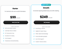
- Price Display: Renders the active configuration cost and/or dynamic price delta for alternative choices. Integrates with the live purchaser calculations.
- Step Panel: Layout wizard navigation. Manages stepper clicks (Previous/Next) and displays page headers/step progress.
- Add-to-Cart Bar: Bottom or side utility bar holding configuration status, quantity selector, final computed price, and the checkout action button.
SEO Title: Configurator UI Primitives
SEO Description: Canonical UI blocks for custom options, color swatches, active price tags, and step-based checkout panels.
Index Alternates:swatchesoption selectorsprice panels